Alfarería Tosta
Clay from Úbeda. Forty countries.
Client
Alfarería Tosta
Location
Úbeda, Jaén
Year
2023
Services
Visual identity · Packaging · Web · Communication system
The tension was real: a brand that could work in the world without losing its roots. That could be in a shop in Tokyo without looking like it had been designed to be in a shop in Tokyo. That would still be from Úbeda even if it was bought in forty countries.
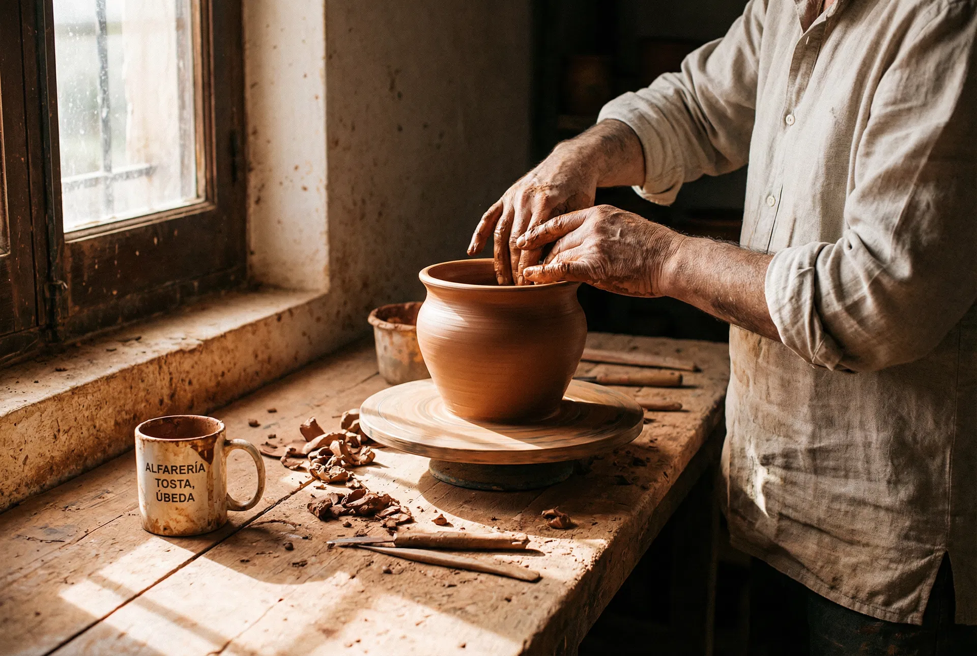
The name comes from the firing process — the toasted piece, transformed by heat. We visited the workshop, saw the hands, understood that the identity had to come from the material: the clay, the earth, the fire. Everything added afterwards had to pass through that filter.
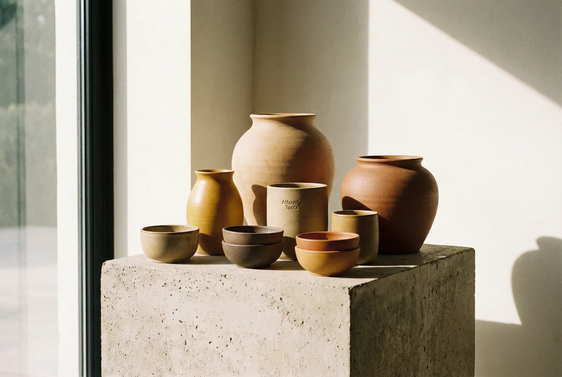
An identity that uses the texture of clay as its main visual element. The logo is a potter's mark — simple, direct, made to last. The packaging uses unbleached kraft paper and single-colour ink. The website is an unpretentious catalogue: the pieces, well photographed, with their dimensions and their story. Tosta does not travel. It arrives.