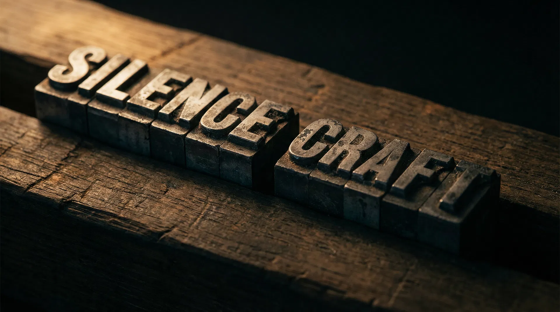
Typography speaks in silence.
How a typeface can define the character of a brand before a single word is read.
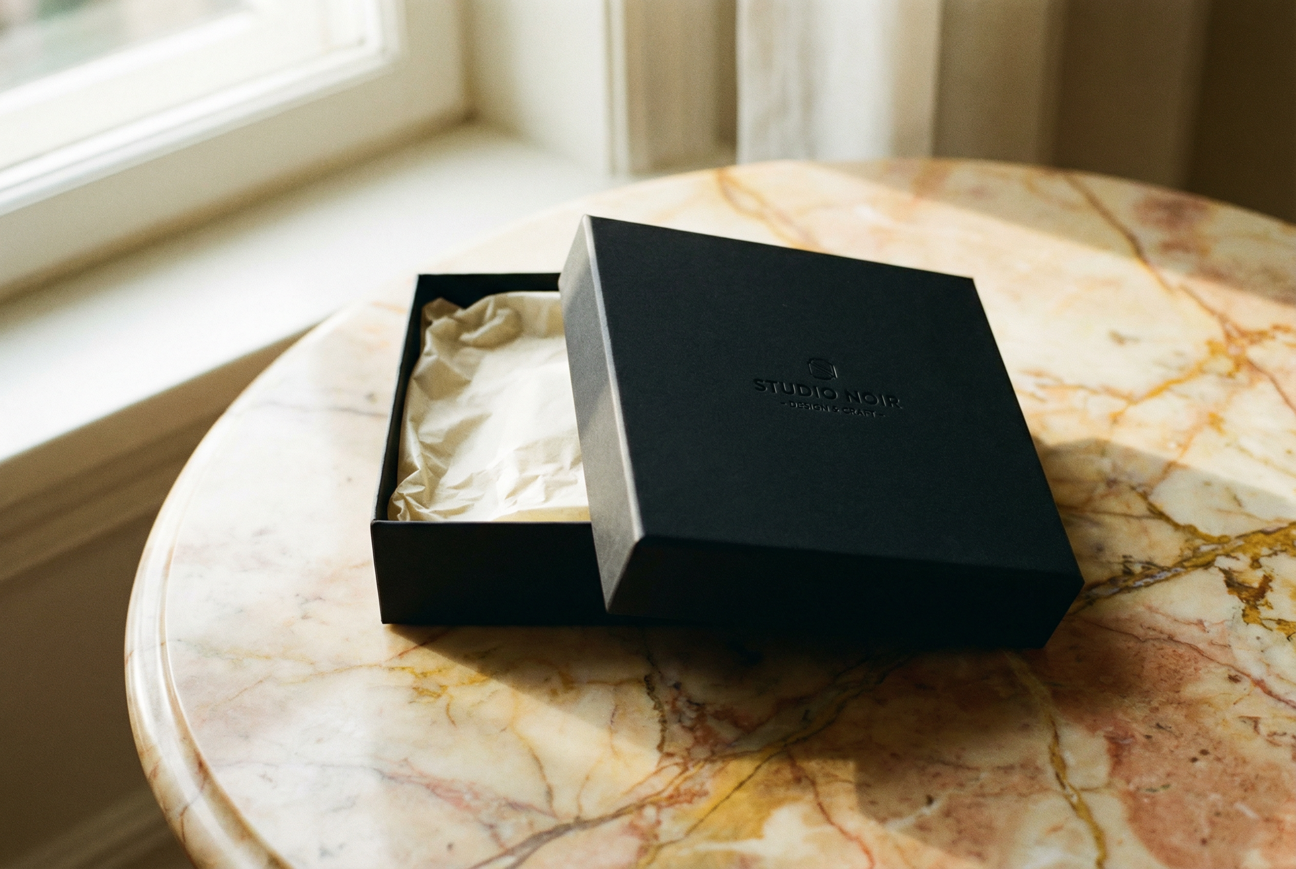
ypography is the most underused and most misunderstood element of brand design. Most clients see it as a final detail, something decided when everything else is already in place. We see it as the decision that determines everything, because typography is not just a shape; it is a voice.
Before the brain processes the meaning of a word, it has already processed its form. The weight of the strokes, the rhythm of the spacing, the emotional temperature of the curves and angles. All of this happens in fractions of a second, below the threshold of consciousness, and produces an impression that conditions how what comes next is received.
This is why typography matters so much in a brand. Not because it is visible, but because it operates invisibly. The client does not know that the typography is telling them something; they only know that this brand conveys trust, or modernity, or precision, or warmth. And that transmission, to a large extent, is the work of typography.
We have seen brands with impeccable strategies and clear positioning that failed in communication because the typography contradicted everything else. A luxury artisan brand with a cold geometric sans-serif. An innovative technology brand with a classic serif that evoked the nineteenth century. The dissonance is not always conscious for the receiver, but it is felt. And when it is felt, it erodes trust.
The right typography does not call attention to itself. It makes everything else fit. When it is well chosen, the logo seems inevitable, the colors make sense, the identity system has internal coherence. When it is poorly chosen, something does not add up and nobody knows exactly why.
Character before content
A thin-stroke serif typeface says something different from a geometric sans-serif, even if both write exactly the same words. One says tradition, precision, time. The other says clarity, modernity, efficiency. Neither is better; they are different voices for different stories.
Garamond has been relevant for five centuries because it captures something true about cultured writing, about the transmission of knowledge, about authority earned over time. Helvetica has been relevant for seventy years because it captures something true about industrial modernity, about functional clarity, about the democracy of design. Futura, about geometry as utopia. Didot, about elegance as distinction.
Every typeface has a cultural history that precedes it and that the receiver's brain has internalized, even if they are not conscious of it. Choosing a typeface is activating that history. That is why the choice cannot be arbitrary; it has to be strategic.
The most common mistake is choosing typography based on personal aesthetics. I like this font is a valid reason for a personal project. For a brand, the question is different: does this font speak the way the brand speaks? Does it reinforce what the brand wants to say, or does it contradict it? Will the client we want to attract perceive it as close, or as foreign?
System, not choice
The typography of a brand is not a font; it is a system. A primary font for headlines, with its character and weight, that establishes the personality of the brand. A secondary font for body text, readable and discreet, that does not compete with the primary but complements it. Sometimes a third for functional details: prices, dates, labels, technical information.
Each font has a role. And the roles do not mix. The headline font is not used for body text because it loses readability. The body font is not used for headlines because it loses character. The typographic system is a hierarchy, and hierarchies work because each level has its place.
In addition to the fonts, the typographic system includes tracking, kerning, line spacing, minimum size, and typographic color. Each of these variables is a decision that affects how the text is perceived. Tracking that is too tight makes the text seem dense and difficult. Line spacing that is too wide makes it seem empty and characterless.
A well-defined typographic system is one of the most valuable assets of a brand, because it guarantees consistency across all media and all contexts, regardless of who is applying the identity. A brand with a clear typographic system can grow and delegate without losing its voice.
The test of time
The best brand typefaces are the ones that still work ten years later. Not the ones that are fashionable; the ones that are true. Helvetica has been relevant for seventy years not because it is modern, but because it is honest. Garamond has lasted five centuries because it captures something that does not change.
Fashionable typefaces age because their relevance depends on a cultural context that changes. In 2010, all startups used the same geometric sans-serif. In 2015, all used the same thin-stroke serif. In 2020, all used the same variable typeface with eye-catching ligatures. Each of those trends seemed fresh at the time and seems dated now.
When we choose typography for a brand, we think in ten years. Will it still be right? Will it still be itself? The test is not whether the typography is beautiful today; it is whether the typography is true. Whether it captures something real about the brand that will not change with trends.
Brands that change their typography every five years to follow trends do not build recognition; they destroy it. Typographic recognition is one of the most valuable assets of a brand, and it is built with time and consistency. Every time the typography changes, you start from zero. That is why the first choice has to be the right one.