Forma Estudio
The precision of lines. The warmth of materials.
Client
Forma Estudio
Location
Madrid
Year
2023
Services
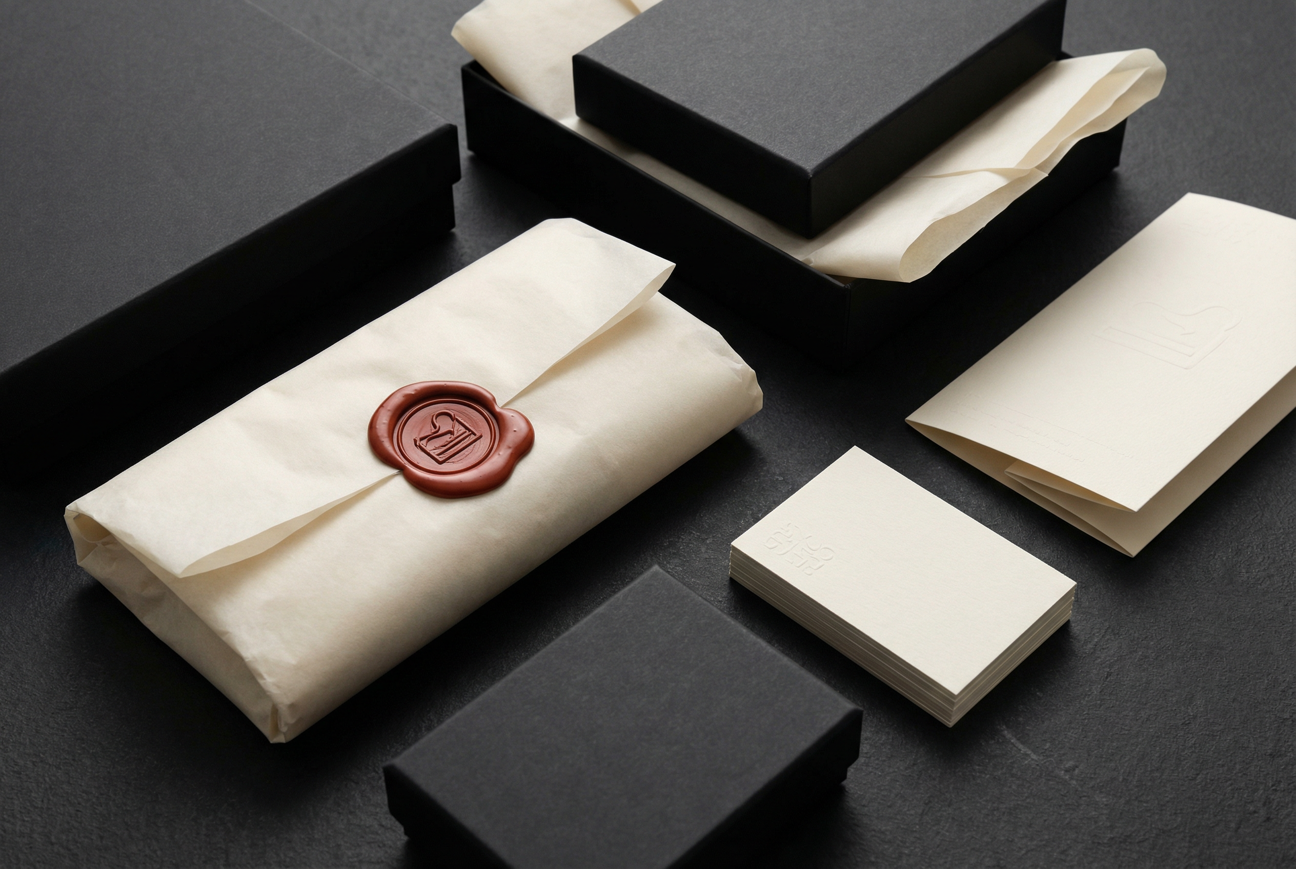
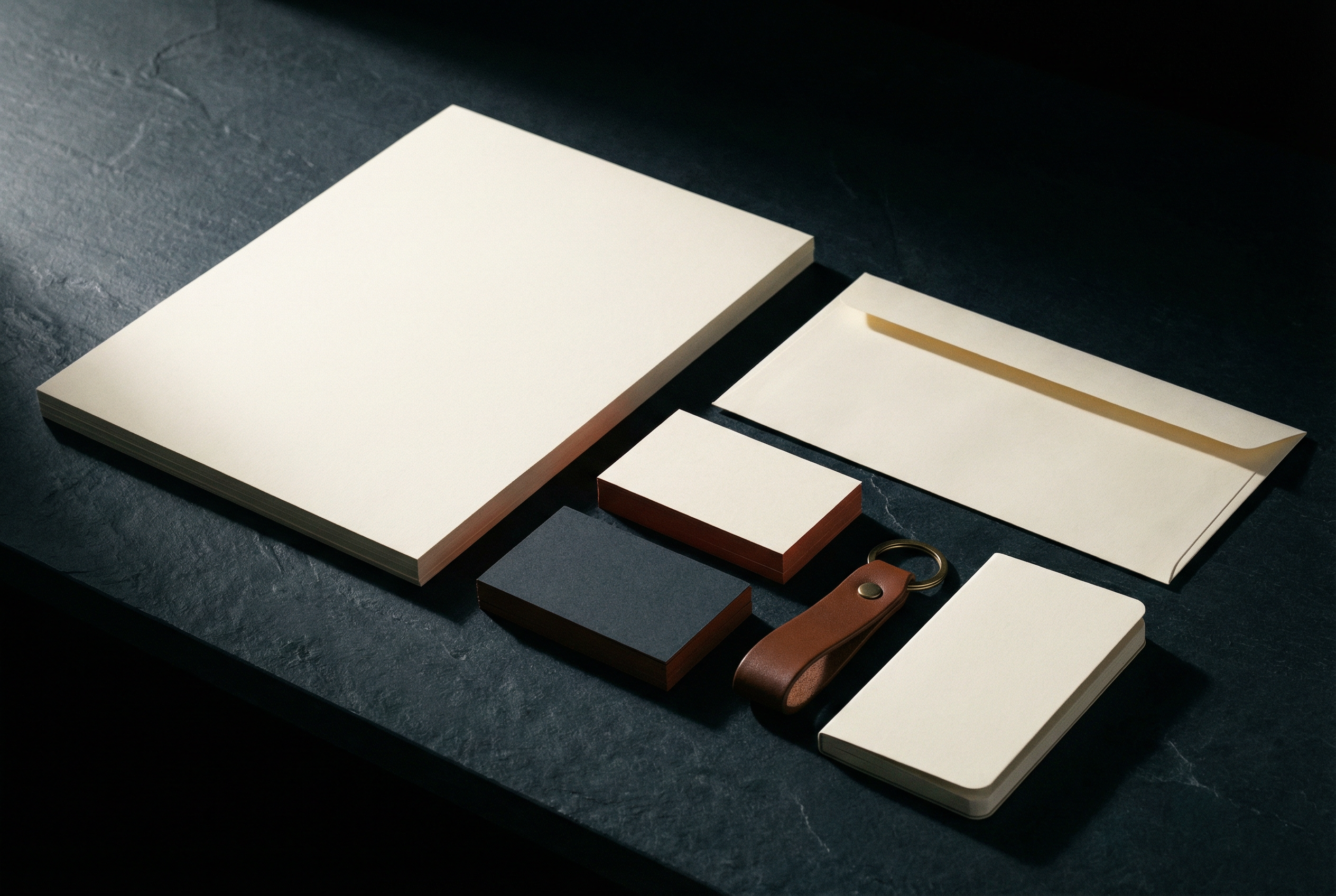
Naming · Visual identity · Web · Corporate stationery
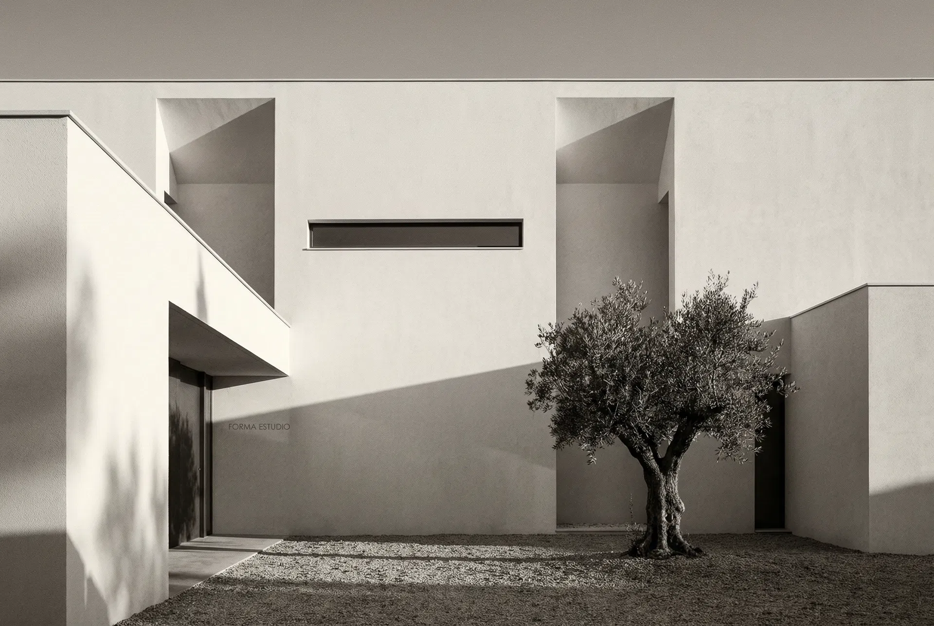
The partners at Forma had spent a decade building extraordinary houses for clients who found them by word of mouth. It worked. But a moment came when they wanted to choose their projects, not just receive them. For that they needed an identity that spoke before they did.
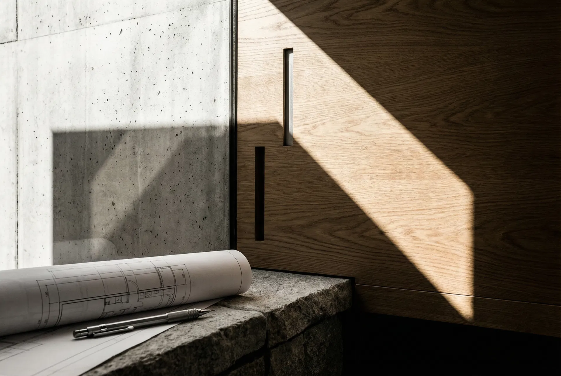
The name already existed — it was what the partners called their studio among themselves, in a low voice, as something that had not yet been said out loud. We formalised it. The identity stems from the tension between two words that define their work: precision and warmth. The logo is an F built with the same logic they use in their plans.
An identity system that works equally well on a technical drawing and on a business card. The palette uses the black of architect's ink and the raw tone of tracing paper. The website is a portfolio without ornament: just the work, well photographed, well presented. Forma does not need to explain itself. Only to be seen.